Websites
Homepage
Your first step in building your website is to decide what information you want to share with the public.
Name, contact info and a few pictures should be the minimum.
The tricky thing about building websites for location scouts, location managers and photographers is that they don't have the time or staff to fill their websites with stories and articles. What they have is usually a lot of interesting pictures if they take the time to select them.
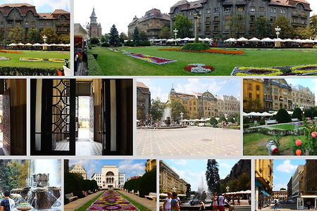
Our approach on building these websites is to work with whatever material you can gather. One photo, 10 photos, several photo albums. Here are some ideas of putting them together.
What doesn't show in these screenshots is how some of these pages are animated or how the tiled images get reshuffled every time you visit the page.
30 samples
Thumbnail View
In thumbnail view we see many photos in a page.
Photos are arranged as mosaic tiles that responds to the size of the viewing device or fixed grids with 2, 3 images across.
There are four basic color schemes. White, light gray, dark gray and black.
The thumbs for images can be treated different than the thumbs for folders. They can be cropped square, rectangular or not at all
Text can be above, below, overlaid or hidden.
10 samples
Large Image View4
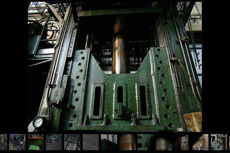
The large image view has the following options.
show/hide the thumbs at the bottom
show/hide the metadata on the side
slideshow auto start on/off
slideshow duration
4 samples
Adding Comments
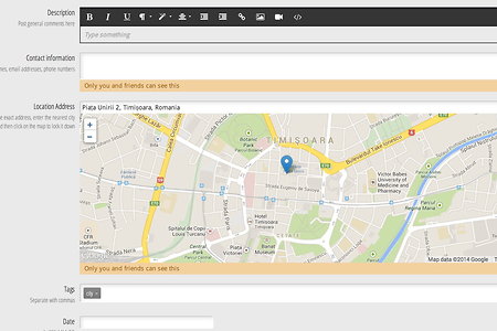
Here you can add descriptions, contact info, address info, tags. You can even add custom fields. You can also add links, embed videos and images.


